 If you’ve been to the DiscountASP.NET website recently you may have noticed its new look. Those of you who remember the old site (and who could forget it?) may have been surprised, or concerned that maybe we’d been bought out or taken over, or that perhaps there had been a catastrophic rupture in the space-time continuum.
I can assure you that it’s still us. We’re still here and we’re still the scrappy, independent .NET host that you know and love. But if you were surprised to see a new site, it’s understandable. After all, the old site had the same general appearance for 14 years, so a lot of you probably assumed it would never change. I get it. There were times that I thought it might never change too.
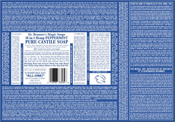
The old site was…well, let’s put it this way, have you ever seen a Dr. Bronner’s soap label?

Crazy, isn’t it. But I know why Dr. Bronner did that. He had a whole lot of messages that he thought were very important, so he used every square millimeter of space on his label to communicate those messages.
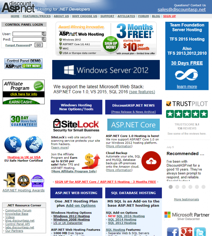
Does it remind you of anything? Like, oh, I don’t know, a certain trusty old website?

Now that site — well, come on, you can see the vintage charm, can’t you? And you can see what it was originally intended to do. It was intended to provide information about a certain specific kind of website hosting to a mostly technically-adept and focused audience that was more interested in information than style. Or, apparently, order.
Though in fairness, that site was designed in 2003, and it became what you see above after 14 years of things constantly being added to it. Also by virtue of being created and maintained by people who aren’t exactly what you’d call professional web designers. If you put the auto mechanic in charge of the garage’s billboard, you aren’t going to get an award winner, you’re going to get what the mechanic thinks is important.
Over the years a couple of attempts to replace the site were explored, then scuttled or sidetracked. The thing is, we’re a lean, mean fighting machine around here, so no one has a lot of “extra” time to do things that aren’t important or time sensitive. Contrary to what you may have heard about Internet companies, we’re not having six hour ping pong tournaments or tapping a keg and building human pyramids out in the parking lot. Not every day, anyway.
So the new site kept being delayed and “set aside for next quarter,” and as a result, it continued to sit there, fundamentally unchanged, mocking us. Actually it didn’t just sit there. Like I said, we added to it. All the time. Information on top of more information, which is how it eventually became Dr. Bronnered.
Then about a year ago (scratch that, I just saw that I first mentioned starting on a new site two years ago – ha), we decided to just do it already. To make the time. Bite the bullet. Drain the swamp. So to speak.
But where to start? Dr. Bronner’s label says, “Dilute! Dilute!” and that’s sound advice for anyone redesigning an old website. Not to dilute the message, but to reduce the visual chaos and focus on fewer messages per page.
So that’s what we set out to do. It started with mapping out the existing site and the hundreds of pages that had been added over the years. Then we went about getting rid of pages, consolidating pages, reducing text, adding some visual breathing room. All of which isn’t particularly difficult.
What is difficult about that process is communicating everything you want to communicate, or feel you need to communicate, while at the same time trying to get rid of half (or more) of the site. That’s the crux of the thing, and the main problem anyone has to overcome on a project like this.

And it’s worth pointing out that the considerations you have to make for a website today are slightly different than they were in 2003. Back then we only expected to see https on an order form, not across an entire site. We didn’t browse hosting websites (or any websites) on our phones (remember composing text messages by repeatedly pressing the numbers on your phone keypad?). Having a “responsive” website meant that you answered email questions in less than a day.
How did we even survive back then? The mind boggles.
Of course today’s websites have to be more flexible and simple to adapt to the way we use the web now. But the underlying code necessary to give the illusion of simplicity is increasingly intricate, so simplifying a website involves a tremendous number of decisions and concessions. Not to mention a lot of letting go of old ideas. It can can get to a point where you start to wonder, “Who thought this was a good idea?” and find yourself looking at your old site thinking, “You know, it’s not that bad…”
Did I say we started on the new site a year ago? Yes I did. Even after deciding to “just do it already,” it took a long time to get it done. As I mentioned, none of us have much time to spare on a typical day, and there were 568 pages to go through on the old site with the end goal of consolidation and reduction. The new site has only half as many pages. And if you don’t count the archived press releases, there are a mere 104 pages on the new site. That’s a pretty fair pruning, I’d say.
But you know the urban legend that says that it takes so long to paint the Golden Gate Bridge that by the time they finish, they have to start over again at the other end? Well, the same thing happened with the new site. Since it took so long to finish, we had to go back and update half the pages with more recent information before we launched it.
Well, that’s our problem, not yours. But I’ll bet more than a few people reading this have tackled similar projects. Or have a similar project haunting them, waiting to be tackled. All I can say is, just do it already. You may feel miserable while you’re in the midst of it, but when you get to the end of the bridge and put down the paintbrush you will want to shout and leap up and down and buy yourself an expensive bottle of bourbon. Go ahead do do all those things. You will deserve it.
When you’re looking at our new site it may seem sparse, and not terribly visually exciting, especially if you compare it to the the Electric Kool-Aid Acid Test of years past. But it does what it’s supposed to do. And more importantly, what you need it to do. It presents specific information about a lot of different things, in way that’s (hopefully!) easy to navigate and lends itself to more relevant and fruitful discovery.
And if it starts to look stale in another decade or so, we’ll do it all again. But by then we’ll all be commuting in flying Google cars, just like the Jetsons, right? Maybe we’ll luck out by that time and websites will redesign themselves.
Hmm, that’s not a bad idea…websites that redesign themselves…
Excuse me, I have to go update the next development meeting agenda. See you later.
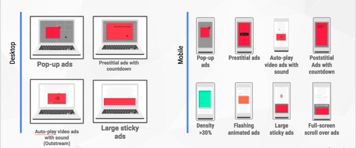
![]() Starting on Thursday, February 15th 2018, Google turned on what they call “Ad Filtering” for their Chrome browser. What that means is Chrome will now block ads natively instead of you having to install an ad-blocker extension to the browser. This all starts with Chrome version 64 and will affect Windows, Mac, Linux, Chrome OS, and Android. The iOS version of Chrome is Safari-based so it will not have the ad-blocking yet.
Starting on Thursday, February 15th 2018, Google turned on what they call “Ad Filtering” for their Chrome browser. What that means is Chrome will now block ads natively instead of you having to install an ad-blocker extension to the browser. This all starts with Chrome version 64 and will affect Windows, Mac, Linux, Chrome OS, and Android. The iOS version of Chrome is Safari-based so it will not have the ad-blocking yet.


 By now you may have read about an issue affecting Intel, AMD, and other processors, potentially exposing sensitive memory data. Until now, that data has been assumed to be safe, since a program running on a system isn’t supposed to be able to access the memory used by the kernel or core of that system. There are two separate bugs involved, known by the names “